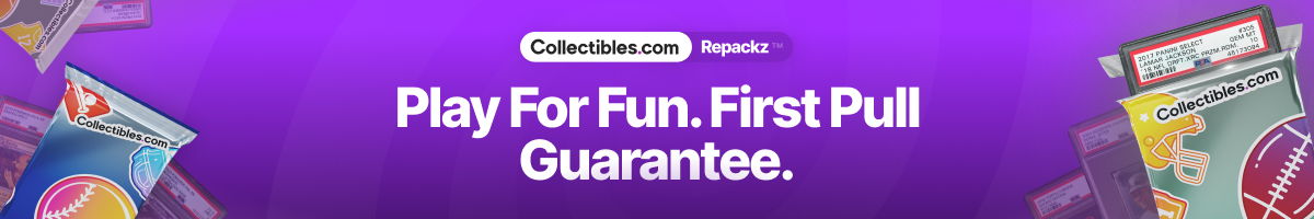


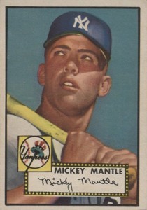
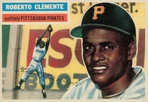
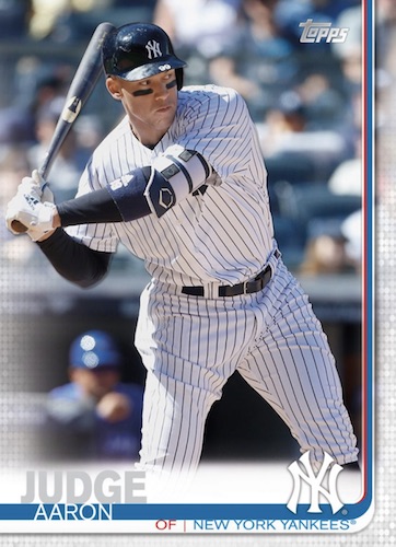
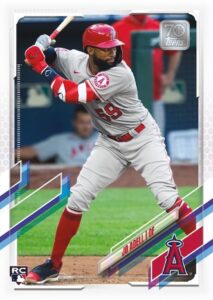
Evolution of Topps Baseball Cards: 1951-2024 Designs Timeline Gallery
Produced across many decades, Topps baseball cards have become an institution for fans and collectors. Not only do the players change over time, but so do the designs. The flagship gallery below compiles the primary Topps baseball design from every year so collectors can look back to see how each version stacks up.
When you've manufactured cards for as long as Topps has, you wind up with a mix of good years, bad years, so-so years, off years, on years and everything in between. And even then, it's a matter of taste and preference. What one collector might like, another collector may absolutely despise. However, given the many designs, it is safe to assume nearly any collector can find at least one style that works for them from the storied flagship line.
The best Topps baseball designs bring a personality to them that's both of the era and, in the same vein, timeless. Memorable sets also have that "x-factor" that comes in the form of a classic rookie card or something in the content that leaves a lasting impression.
In 2015, we asked collectors to decide the best sets of all-time in a bracket voting format. View the top set in our detailed voting results page.
Here's a look at all the Topps flagship baseball card designs from 1951 through 2024. Please note that this gallery only includes the year's main set design and not any inserts, special issues or related brands. A full yearly lineup of the main Topps Baseball sets can be reviewed in our flagship database.
Got a favorite set? Let us know in the comments below.
Topps Baseball Card Designs Through the Years: 1951-2024
Click on the links below to check out detailed profiles for each set, including a checklist and series info.


 | Making purchases through affiliate links can earn the site a commission |


Multiple authors contributed to this article.


Great Insights
This post is packed with great insights.Visit us: Great Insights