


Complete Visual History of Topps Football Card Designs: 1951 to 2012
It the six-plus decades that Topps has been producing football cards, a lot has changed. For many of the early years, cards focused on the players. Portraits and head shots were used more often than action shots. And even many of those look posed. Another big change in Topps football card designs has been the transition from painted pictures to photographs. The biggest difference, though, has to be in the feel of the cards themselves. Hold something a Topps football card from the 1950s or 1960s and there's a distinct cardboard texture that runs through your fingers. Modern technology has given way to something smoother, something shinier.
1951 Topps Magic Football was the company's first foray into the sport. From there, it wasn't until the college-themed 1955 Topps All American Football that they tried again. Beginning in 1956 and every year since, Topps has produced cards for the NFL.
Topps football card designs have varied widely over the years. Early on, they changed greatly with each new set. Looking at the first NFL sets from 1956 to 1959, they share little in common. 1956 Topps Football had a vertical design that was dominted by a player photo and a colorful background. The next year, the layout used two photos on a horizontal design. From there, photos were placed inside an oval border. Finally, 1959 Topps Football reverted back to something similar to 1956, but with even more color.
Perhaps the biggest jump in Topps football card designs came in 1965. While the cards themselves look fairly traditional in their layout, the 'tall boys' are larger than normal. Measuring 2 1/2" by 4 11/16", it was a one-time deviation.
Designs got a modern boost in the early 1990s. Standard card stock gave way to glossy cards. Foil enhancements also became common. Some may argue that these advances take away from the nostalgia of collecting, but they have also led to sharper photos and better quality control.
Below you will find samples of all flagship Topps football card designs from 1951 to 2012. While this doesn't include off-shoot brands, we did include the 1984 Topps USFL and 1985 Topps USFL sets.
What set is your favorite? Feel free to answer in the comments section below.
Visual Guide to Topps Football Card Designs 1951 to 2012
-

- 1951 Topps Magic Football

-

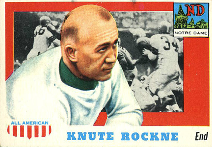
- 1955 Topps All American Football
-

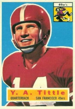
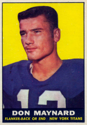
- 1956 Topps Football
-

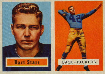
- 1957 Topps Football
-

- 1958 Topps Football

-

- 1959 Topps Football

-

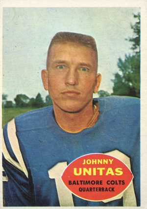
- 1960 Topps Football
-

- 1961 Topps Football
-

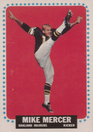
- 1962 Topps Football

-

- 1963 Topps Football

-

- 1964 Topps Football
-

- 1965 Topps Football
-

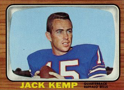
- 1966 Topps Football
-

- 1967 Topps Football

-

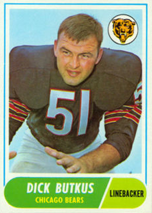
- 1968 Topps Football
-

- 1969 Topps Football

-

- 1970 Topps Football

-

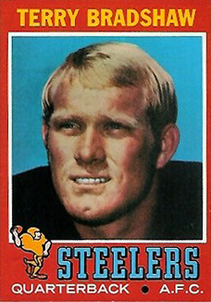
- 1971 Topps Football
-

- 1972 Topps Football
-

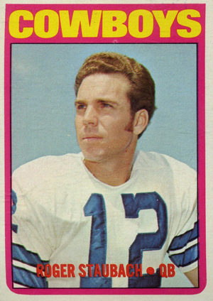
- 1973 Topps Football

-

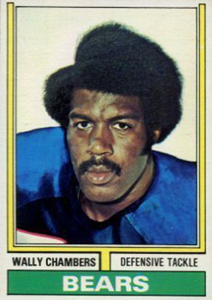
- 1974 Topps Football
-

- 1975 Topps Football

-

- 1976 Topps Football

-

- 1977 Topps Football

-

- 1978 Topps Football

-

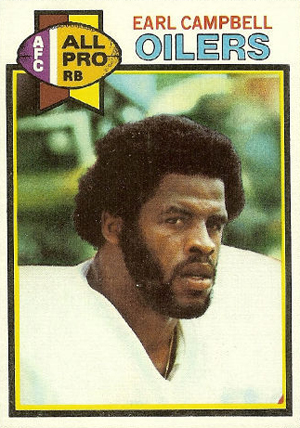
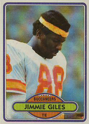
- 1979 Topps Football
-

- 1980 Topps Football
-

- 1981 Topps Football

-

- 1982 Topps Football

-

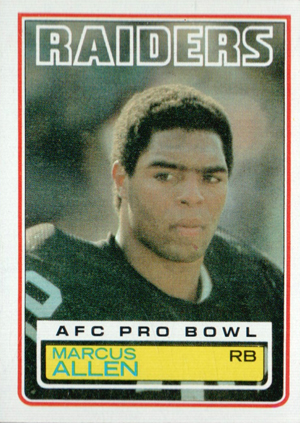
- 1983 Topps Football
-

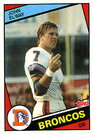
- 1984 Topps Football
-

- 1984 Topps USFL Football

-

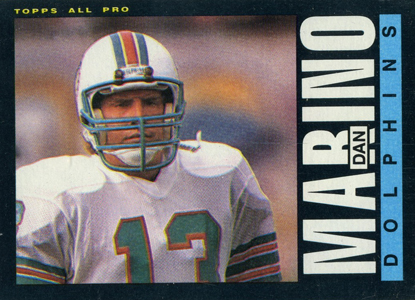
- 1985 Topps Football
-

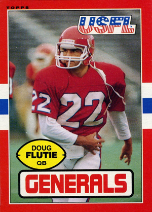
- 1985 Topps USFL
-

- 1986 Topps Football

-

- 1987 Topps Football

-

- 1988 Topps Football

-

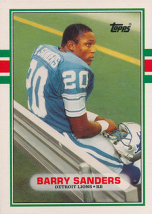
- 1989 Topps Football
-

- 1990 Topps Football

-

- 1991 Topps Football

-

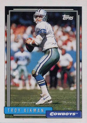
- 1992 Topps Football
-

- 1993 Topps Football

-

- 1994 Topps Football

-

- 1995 Topps Football

-

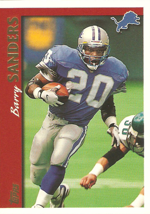
- 1996 Topps Football

-

- 1997 Topps Football
-

- 1998 Topps Football

-

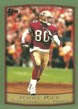
- 1999 Topps Football
-

- 2000 Topps Football

-

- 2001 Topps Football

-

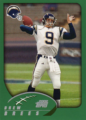
- 2002 Topps Football
-

- 2003 Topps Football

-

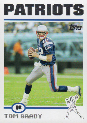
- 2004 Topps Football
-

- 2005 Topps Football

-

- 2006 Topps Football

-

- 2007 Topps Football

-

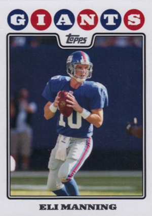
- 2008 Topps Football
-

- 2009 Topps Football

-

- 2010 Topps Football

-

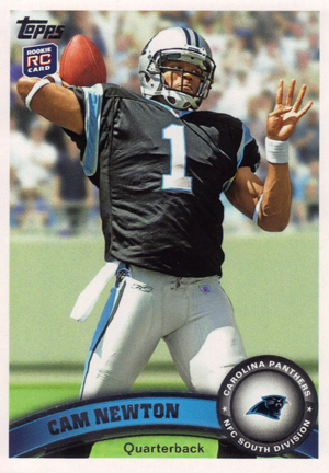
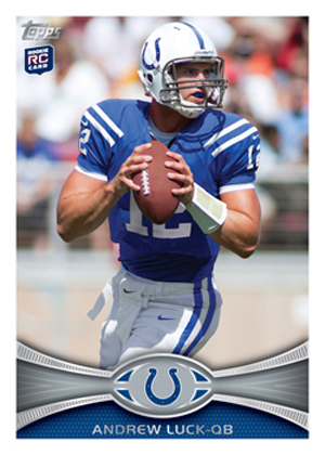
- 2011 Topps Football
-

- 2012 Topps Football
 | Making purchases through affiliate links can earn the site a commission |


JOHN HERLING
Starting around 1989, to an increasing degree, Topps showed the players wearing helmets rather than with their faces shown. This was a huge step backwards in card design, since it’s hard to have any feelings about players whose faces you can’t see. They might as well all be robots.