MINT 2023
DRIP – 600×100
2016 Topps Baseball Design Revealed

2016 Topps Baseball Design Revealed

Although the 2016 MLB season might seem like the distant future for many fans and collectors, Topps wasted no time releasing the base design for their popular flagship release.

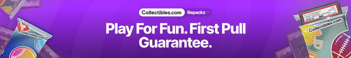
While no other specifics were revealed, the 2016 Topps Baseball design immediately sticks out in comparison to previous years. Featuring as close to a full-bleed design that the annual release has ever displayed, there is also a faint smokey effect in the corners of the Buster Posey card. Most notable, the design does not have the familiar white border that has become a mainstay of recent releases. View all the previous Topps flagship base designs here.

2016 Topps Baseball Design Revealed 1

This change comes as a result of trying to update the design beyond the norm. According to Topps senior art director John Doldan, "We have had a white border for so many years and it was sort of a staple of the Topps design. I think we are trying to move forward and make the cards a little more modern and current. I think gradually we have been going in that direction and break from the past a little bit."

Additionally, a diagonal team logo is placed in the corner alongside a small text box at the bottom.

Let us know your thoughts on the new design in the comments below.

Check back as more information about 2016 Topps Baseball is made available.

Top eBay Listings Making purchases through affiliate links can earn the site a commission
Trey is a lifelong sports fanatic. He is a huge fan of the NBA and NFL, as well as soccer, college basketball and college football. As a kid, he collected football and basketball cards. In more recent years, he started collecting basketball cards again on a whim and has since expanded to other sports and entertainment options.

User Comments

Kenny Kraly Jr
Kenny Kraly Jr

I like the design it fits this new direction Topps wants to do. Can’t wait for 2016 Topps Baseball when the boxes and the factory set comes out!!!

Raymond
Raymond

Not sure I like this new direction. When you think of Topps you think of baseball cards that been around forever. You want the classic baseball card look you go with Topps. The white border made that card look like a classic Topps card. Now it looks just like everything else Topps just hurries up just to get it out, we have Stadium Club if you want to go that way. With Topps unable to make football cards in 2016 they really need to focus there time on making quality baseball cards.

Mike
Mike

I still love the look of the white border. It gives the card a finished look.

Franco C
Franco C

If it eliminates the multi-colored border cards, I’m all for it! — looks good, just reminds me of Stadium Club.

John francis
John francis

It’s ok would like to see something like the 1972 or 1975 topps baseball set borders though

I love the new design. A breath of fresh air in the hobby.

Louis
Louis

Pretty good. I like the direction. I think something a little more flat without all the crazy gradients, bevels, and drop shadows would be more contemporary but overall looks nice.

The only thing is that the white border approach was so iconic of the flagship set and this direction moves towards what they’re doing in other product lines.

If they drop some flailing products and consolidate i think that would be a benefit to a more modern approach.

Leave a Comment:

will not be published