Home » Baseball » Baseball Cards » 2012 Topps Baseball Design Revealed
This afternoon Topps offered the first look at their design for the flagship 2012 Topps Baseball set via Twitter:
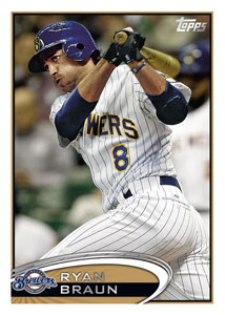
It's a very minimal design featuring a white border and lots of room for the photo. The nameplate on the bottom stands out with a sunburst feel to it.
Just the one image of Ryan Braun was teased, however expect more to come.
 | Making purchases through affiliate links can earn the site a commission | |

$299.95

$379.88

$199.99

$249.99

$199.99

$399.95

$5,999.99

$3,470.00

$5,900.00

$34.99

$149.99

$99.95

$390.00

$60.00

$199.99

$175.00

$54.58

$64.36

$112.95

$79.26
Ryan is a former member of The Cardboard Connection Writing Staff.
His collecting origins began with winter bike rides to the corner store, tossing a couple of quarters onto the counter and peddling home with a couple packs of O-Pee-Chee hockey in his pocket. Today, he continues to build sets, go after inserts with cool technologies, chase Montreal Expos and finish off his John Jaha master collection.












David T
Looks cheap. I know the 61st of anything isn’t really all that special, but don’t you think Topps could spend more than 30 seconds putting together a product that has the potential for millions in revenue? If I’m on the Topps future design committee, my FIRST act would be to poll collectors (obviously a large task, but we’re taking a leap in reality already, right?) and find out what the CONSUMERS WANT. Find a way to make each year’s set special/unique and we might actually see some kind of resurgence in the popularity of set collecting. But hey what do I know, I only buy the stuff….well not next year’s.